Appearance
Reusable Components
In this chapter, we will streamline our code by leveraging reusable Blade components. Blade components enable us to adhere to the DRY (Don't Repeat Yourself) principle, allowing us to reuse components throughout our application. We have already encountered static Blade components, such as layout components with child components like the theme switcher. Now, we will focus on making our components dynamic.
Laravel offers two primary types of components:
- Components with a dedicated class: For example, the layout component, which encapsulates complex logic and rendering behavior.
- Components without a class (anonymous components): For example, the navigation and footer elements within a layout, which are simpler and more declarative.
In this chapter, we will create several anonymous components that we will utilize later in the course.
TIP
To facilitate component development and testing:
- Create a temporary playground page (
resources/views/playground.blade.php) for testing our components in isolation. - Define a route to the playground page in
routes/web.php. - Create our components within a subfolder
resources/views/components/itf(IT Factory 😉) to prevent potential overwrites from third-party component libraries.
php
Route::view('/', 'home')->name('home');
Route::view('contact', 'contact')->name('contact');
Route::view('playground', 'playground')->name('playground');
...Alert Component
We will create a reusable alert component with optional properties for defining the alert type (variant), title, icon, and dismissibility. This component will be built step-by-step to illustrate the underlying concepts.
Reference
The following table outlines the attributes and properties of the alert component:
(The distinction between attributes and properties will be explained in a moment.)
| Attribute | Prop | Default | Description |
|---|---|---|---|
variant | variant | null | The alert type: info, success, warning, error |
title | title | null | The alert title |
icon | icon | null | The alert icon (Heroicons or Lucide) |
dismissible | dismissible | false | Whether the alert can be dismissed |
self-destruct | selfDestruct | 0 | Time (in milliseconds) before the alert automatically closes |
REMARKS
Attributes on the outer component tag are mostly written in kebab-case (e.g., self-destruct), while PHP variables can't be written with a dash. Therefore, the corresponding property (PHP variable) is written in camelCase (e.g., selfDestruct).
Let's begin with the basic structure of the component.
- Create a new alert component in the
components/itffolder:resources/views/components/itf/alert.blade.php. - Open the file and add the following code:
php
<div class="border border-zinc-200 dark:border-zinc-700 bg-zinc-50 dark:bg-zinc-800 p-3 my-4 rounded-xl flex items-start gap-4">
    <div class="flex-1">
        {{ $slot }}
    </div>
</div>Now, let's integrate different types of alerts into our playground page. Initially, all alerts will appear identical since we haven't incorporated any properties yet.
php
<x-layouts.vinylshop title="Playground">
<h2 class="text-md font-bold italic my-4 pb-2">Alert component</h2>
Component Attributes
All attributes assigned to the component (e.g., variant, title, icon, dismissible, self-destruct) are accessible within the component through the $attributes variable (also known as the attributes bag). To retrieve a specific attribute, such as variant, you can use$attributes->get('variant').
The $attributes bag provides several useful methods like:
| Method | Description |
|---|---|
$attributes->get('key', $default = null) | Retrieves the value of the specified key, returning $default if not found. |
$attributes->only('key') | Returns a subset of the attributes, accepting a single key or an array of keys. |
$attributes->merge(['key' => 'value']) | Merges the provided array with the existing attributes. |
$attributes->has('key') | Determines if the specified key exists in the attributes (true or false). |
$attributes->except('key') | Returns all attributes except those specified by a single key or an array of keys. |
Component Properties
The @props directive allows you to define custom properties for a component. If a property name matches an attribute name, the attribute's value is automatically assigned to the property, and the attribute is removed from the attributes bag. This mechanism simplifies data handling and enhances component flexibility.
Let's illustrate how the @props directive interacts with the alert component:
JUST FOR DEMONSTRATION PURPOSES
The following example demonstrates the interaction between attributes and properties. This code is for illustrative purposes only and does not need to be added to your component.
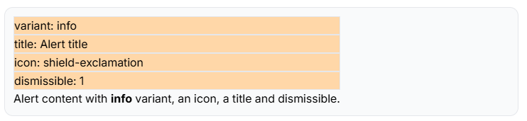
This code iterates through all attributes and displays them within an orange box.
php
<div class="border ...">
    <div class="flex-1">
        @foreach ($attributes as $key => $value)
            <p class="border p2-2 bg-orange-200">{{ $key }}: {{ $value }}</p>
        @endforeach
        {{ $slot }}
    </div>
</div>The output for the alert component with four attributes is shown below.
Now that we understand the distinction between attributes and properties, we can update the alert component accordingly. While there are various approaches to achieve the same result using a combination of properties and attributes, the simplest method involves converting all attributes (except the class attribute) to properties. This is because properties can have default values, while attributes cannot.
- Add the
@propsdirective to the alert component and define all attributes as properties, providing a default value for each property.
php
@props([
    'variant' => null,
    'title' => null,
    'icon' => null,
    'dismissible' => false,
    'selfDestruct' => 0,        // attribute self-destruct must be written as selfDestruct!
])

<div class="p-3 my-4 rounded-xl flex items-start gap-4 border border-zinc-200 dark:border-zinc-700 bg-zinc-50 dark:bg-zinc-800">
    <div class="flex-1">
        {{ $slot }}
    </div>
</div>variant Property
Let's implement the variant property first. The color of the alert will change based on the value of the variant property. The PHP match expression is ideal for this, as it allows us to compare a value against multiple cases. If the value does not match any of the cases, the default case will be executed.
- Add a
caseblock for each variant and assign the corresponding color to the$colorvariable. - Update the
classattribute with the value of the$colorvariable.
The default case contains the classes we used in the first version of the alert component. We will add the classes for the different variants in the case blocks.
php
@props([
    'variant' => null,
    'title' => null,
    'icon' => null,
    'dismissible' => false,
    'selfDestruct' => 0,        // attribute self-destruct must be written as selfDestruct!
])

@php
    $color = match ($variant) {
        'success' => 'border-emerald-200 dark:border-emerald-700 bg-emerald-50 dark:bg-emerald-900/50 text-emerald-800 dark:text-emerald-100',
        'error' => 'border-red-200 dark:border-red-700 bg-red-50 dark:bg-red-900/50 text-red-800 dark:text-red-100',
        'warning' => 'border-yellow-200 dark:border-yellow-700 bg-yellow-50 dark:bg-yellow-900/50 text-yellow-800 dark:text-yellow-100',
        'info' => 'border-blue-200 dark:border-blue-700 bg-blue-50 dark:bg-blue-900/50 text-blue-800 dark:text-blue-100',
        default => 'border-zinc-200 dark:border-zinc-700 bg-zinc-50 dark:bg-zinc-800',
    };
    $color = "p-3 my-4 rounded-xl flex items-start gap-4 border $color";
@endphp

<div class="{{ $color }}">
    <div class="flex-1">
        {{ $slot }}
    </div>
</div>Merge Class Attributes
Our initial component includes several classes that are not yet visible. Since an HTML tag can only have one class attribute, we need to merge the classes defined outside the component with those defined inside the component. This can be accomplished using the merge method on the $attributes bag.
- Replace the
classattribute in the component with themergemethod.
php
@props([
    'variant' => null,
    'title' => null,
    'icon' => null,
    'dismissible' => false,
    'selfDestruct' => 0,        // attribute self-destruct must be written as selfDestruct!
])

@php
    $color = match ($variant) {
        'success' => 'border-emerald-200 dark:border-emerald-700 bg-emerald-50 dark:bg-emerald-900/50 text-emerald-800 dark:text-emerald-100',
        'error' => 'border-red-200 dark:border-red-700 bg-red-50 dark:bg-red-900/50 text-red-800 dark:text-red-100',
        'warning' => 'border-yellow-200 dark:border-yellow-700 bg-yellow-50 dark:bg-yellow-900/50 text-yellow-800 dark:text-yellow-100',
        'info' => 'border-blue-200 dark:border-blue-700 bg-blue-50 dark:bg-blue-900/50 text-blue-800 dark:text-blue-100',
        default => 'border-zinc-200 dark:border-zinc-700 bg-zinc-50 dark:bg-zinc-800',
    };
    $color = "p-3 my-4 rounded-xl flex items-start gap-4 border $color";
@endphp

<div {{ $attributes->merge(['class' => $color]) }}>     // merge the classes
    <div class="flex-1">
        {{ $slot }}
    </div>
</div>CONFLICTING CLASSES
In some cases, classes defined outside the component may conflict with classes defined inside the component. For example, if you use the background color class bg-xxx-xxx on the outside and the background color class bg-yyy-yyy on the inside, you have two conflicting background colors. In such cases, the background color class that takes precedence depends on the order in which the classes are compiled in the CSS file.
To ensure that the background color class defined outside the component always takes precedence, you can add the ! symbol at the end of the class name. For example, bg-xxx-xxx! will be compiled as background-color: xxx !important; and will always override the background color background-color: yyy; defined inside the component.
title Property
If the title property is not null, we want to display the title above the content (the $slot) of the alert.
- Add an
ifstatement to check if thetitleproperty is notnulland display the title in anh3tag.
php
@props([
    'variant' => null,
    'title' => null,
    'icon' => null,
    'dismissible' => false,
    'selfDestruct' => 0,        // attribute self-destruct must be written as selfDestruct!
])

@php
    $color = match ($variant) {
        'success' => 'border-emerald-200 dark:border-emerald-700 bg-emerald-50 dark:bg-emerald-900/50 text-emerald-800 dark:text-emerald-100',
        'error' => 'border-red-200 dark:border-red-700 bg-red-50 dark:bg-red-900/50 text-red-800 dark:text-red-100',
        'warning' => 'border-yellow-200 dark:border-yellow-700 bg-yellow-50 dark:bg-yellow-900/50 text-yellow-800 dark:text-yellow-100',
        'info' => 'border-blue-200 dark:border-blue-700 bg-blue-50 dark:bg-blue-900/50 text-blue-800 dark:text-blue-100',
        default => 'border-zinc-200 dark:border-zinc-700 bg-zinc-50 dark:bg-zinc-800',
    };
    $color = "p-3 my-4 rounded-xl flex items-start gap-4 border $color";
@endphp

<div {{ $attributes->merge(['class' => $color]) }}>
    <div class="flex-1">
        @if ($title)
            <h3 class="font-bold mb-2">{{ $title }}</h3>
        @endif
        {{ $slot }}
    </div>
</div>icon Property
If the icon property is not null, we add a Flux icon component to the alert. The value of the icon property must match the name of an icon in the Heroicons or Lucide collection. (Remember to import the Lucide icon first to use it in the component.)
php
@props([
    'variant' => null,
    'title' => null,
    'icon' => null,
    'dismissible' => false,
    'selfDestruct' => 0,        // attribute self-destruct must be written as selfDestruct!
])

@php
    $color = match ($variant) {
        'success' => 'border-emerald-200 dark:border-emerald-700 bg-emerald-50 dark:bg-emerald-900/50 text-emerald-800 dark:text-emerald-100',
        'error' => 'border-red-200 dark:border-red-700 bg-red-50 dark:bg-red-900/50 text-red-800 dark:text-red-100',
        'warning' => 'border-yellow-200 dark:border-yellow-700 bg-yellow-50 dark:bg-yellow-900/50 text-yellow-800 dark:text-yellow-100',
        'info' => 'border-blue-200 dark:border-blue-700 bg-blue-50 dark:bg-blue-900/50 text-blue-800 dark:text-blue-100',
        default => 'border-zinc-200 dark:border-zinc-700 bg-zinc-50 dark:bg-zinc-800',
    };
    $color = "p-3 my-4 rounded-xl flex items-start gap-4 border $color";
@endphp

<div {{ $attributes->merge(['class' => $color]) }}>
    @if ($icon)
        {{-- because the icon is a variable, we use the :icon directive instead of icon="$icon" --}}
        <flux:icon :icon="$icon" variant="outline"/>
    @endif
    <div class="flex-1">
        @if ($title)
            <h3 class="font-bold mb-2">{{ $title }}</h3>
        @endif
        {{ $slot }}
    </div>
</div>dismissible Property
If the dismissible property is set to true, we will add a close button to the alert. Clicking the close button will make the alert disappear. We use the show/hide technique from Alpine.js to achieve this.
First, convert the outer div to an Alpine.js component by adding x-data with a default show property set to true. Set the x-show property to the show variable and, after the $slot, add a button with an @click event to toggle the show variable to false. This will hide the alert when the button is clicked.
- Update the alert component to make it dismissible:
php
@props([
    'variant' => null,
    'title' => null,
    'icon' => null,
    'dismissible' => false,
    'selfDestruct' => 0,        // attribute self-destruct must be written as selfDestruct!
])

@php
    $color = match ($variant) {
        'success' => 'border-emerald-200 dark:border-emerald-700 bg-emerald-50 dark:bg-emerald-900/50 text-emerald-800 dark:text-emerald-100',
        'error' => 'border-red-200 dark:border-red-700 bg-red-50 dark:bg-red-900/50 text-red-800 dark:text-red-100',
        'warning' => 'border-yellow-200 dark:border-yellow-700 bg-yellow-50 dark:bg-yellow-900/50 text-yellow-800 dark:text-yellow-100',
        'info' => 'border-blue-200 dark:border-blue-700 bg-blue-50 dark:bg-blue-900/50 text-blue-800 dark:text-blue-100',
        default => 'border-zinc-200 dark:border-zinc-700 bg-zinc-50 dark:bg-zinc-800',
    };
    $color = "p-3 my-4 rounded-xl flex items-start gap-4 border $color";
@endphp

<div
    x-data="{ show: true }"
    x-show="show"
    x-transition.duration.300ms
    {{ $attributes->merge(['class' => $color]) }}>
    @if ($icon)
        <flux:icon :icon="$icon" variant="outline"/>
    @endif
    <div class="flex-1">
        @if ($title)
            <h3 class="font-bold mb-2">{{ $title }}</h3>
        @endif
        {{ $slot }}
    </div>
    @if ($dismissible)
        <flux:icon.x-circle variant="solid" class="cursor-pointer" @click="show = false"/>
    @endif
</div>selfDestruct Property
If the selfDestruct property is greater than 0, we want to hide the alert after a specified time. This can be achieved using the JavaScript setTimeout function. For example, if the selfDestruct property is set to 5000, the alert will automatically hide itself after 5 seconds.
- Add a
setTimeoutfunction to thex-initproperty that sets theshowvariable tofalseafter a specified time.
php
@props([
    'variant' => null,
    'title' => null,
    'icon' => null,
    'dismissible' => false,
    'selfDestruct' => 0,        // attribute self-destruct must be written as selfDestruct!
])

@php
    $color = match ($variant) {
        'success' => 'border-emerald-200 dark:border-emerald-700 bg-emerald-50 dark:bg-emerald-900/50 text-emerald-800 dark:text-emerald-100',
        'error' => 'border-red-200 dark:border-red-700 bg-red-50 dark:bg-red-900/50 text-red-800 dark:text-red-100',
        'warning' => 'border-yellow-200 dark:border-yellow-700 bg-yellow-50 dark:bg-yellow-900/50 text-yellow-800 dark:text-yellow-100',
        'info' => 'border-blue-200 dark:border-blue-700 bg-blue-50 dark:bg-blue-900/50 text-blue-800 dark:text-blue-100',
        default => 'border-zinc-200 dark:border-zinc-700 bg-zinc-50 dark:bg-zinc-800',
    };
    $color = "p-3 my-4 rounded-xl flex items-start gap-4 border $color";
@endphp

<div
    x-data="{ show: true }"
    @if ($selfDestruct > 0)
        x-init="setTimeout(() => show = false, {{ $selfDestruct }})"
    @endif
    x-show="show"
    x-transition.duration.300ms
    {{ $attributes->merge(['class' => $color]) }}>
    @if ($icon)
        <flux:icon :icon="$icon" variant="outline"/>
    @endif
    <div class="flex-1">
        @if ($title)
            <h3 class="font-bold mb-2">{{ $title }}</h3>
        @endif
        {{ $slot }}
    </div>
    @if ($dismissible)
        <flux:icon.x-circle variant="solid" class="cursor-pointer" @click="show = false"/>
    @endif
</div>Table Component
The table component is a versatile component that can be used to display tabular data in a structured and visually appealing way. We also use the colgroup element to define the width of each column.
- Create a new table component in the
components/itffolder:resources/views/components/itf/table/index.blade.php. - Add a table component to the playground page to test the table.
php
<x-layouts.vinylshop title="Playground">
<h2 class="text-md font-bold italic my-4 pb-2">Table component</h2>
- Open the index file and add the following code:
php
@props([
    'border' => false,
    'cols' => [],       // e.g. cols="w-12, w-auto, w-[200px]"
])

@php
    $border = $border ? 'border border-zinc-800/10 dark:border-white/20' : '';
    if($cols) {
        $cols = explode(',', $cols);
    }
@endphp
<table {{ $attributes->merge(['class' => "
            $border w-full text-left align-top
            text-sm  text-zinc-500 dark:text-zinc-300
            [&_tr]:border-b [&_tr]:border-zinc-800/10 [&_tr]:dark:border-white/20
            [&_tbody_tr:last-child]:border-b-0 [&_tfoot_tr:last-child]:border-b-0
            [&_th]:border-b-3 [&_th]:border-zinc-800/10 [&_th]:dark:border-white/20
            [&_td]:p-2 [&_th]:p-2
            "]) }}>
    @if($cols)
        <colgroup>
            @foreach($cols as $col)
                <col class="{{ trim($col) }}">
            @endforeach
        </colgroup>
    @endif
    {{ $slot }}
</table>This component has only two properties: border and cols. The border property is optional and adds a border to the table. The cols property is used to define the width of each column in the table. The cols property is a comma-separated list of classes that define the width of each column.
If the cols property is set, we use the PHP explode function to split the string into an array of classes. We then loop through this array to create a col element for each column, applying the specified class to set the column's.
[&_] classes in Tailwind CSS
The [&_] notation is used to apply a class to a specific element within a parent element.
Classes on the table tag:
[&_tr]applies the class to alltrelements within the table.[&_tbody_tr:last-child]applies the class to the lasttrelement in thetbody.[&_th]applies the class to allthelements within the table.- etc.
This ensures that the classes are only applied to the specific elements within the table, so we don't need to apply all these classes manually to each element when adding rows or columns inside the table component.
Reference
| Attribute | Prop | Default | Description |
|---|---|---|---|
border | border | false | If true, adds a border to the table |
cols | cols | [] | A comma-separated list of classes defining the width of each column in the table |
Sortable Header Component
A sortable header component allows users to sort the table data by clicking on the table header. This component will be very useful in combination with Livewire to sort and paginate data.
In this example, we will use fixed parameters for the sorting direction and the default sort column. Later, when we kwow how to use this component in Livewire, we will make these parameters dynamic.
- Create a new sortable-header component in the
components/itf/tablefolder:resources/views/components/itf/table/sortable-header.blade.php. - Replace the first two table headers in the previous example with sortable headers.
php
<x-layouts.vinylshop title="Playground">

    <h2 class="text-md font-bold italic my-4 pb-2">Table component</h2>

    <x-itf.table cols="w-32, w-auto, w-[200px]">
        <tr>
            <x-itf.table.sortable-header :sorted="true" direction="asc">Header 1</x-itf.table.sortable-header>
            <x-itf.table.sortable-header :sorted="false">Header 2</x-itf.table.sortable-header>
            <th>Header 3</th>
        </tr>
        <tr>
            <td>Row 1, Cell 1</td>
            <td>Row 1, Cell 2</td>
            <td>Row 1, Cell 3</td>
        </tr>
        ...
    </x-itf.table>
    ...
</x-layouts.vinylshop>- Open the sortable header file and add the following code:
php
@props([
    'sorted' => false,
    'direction' => 'asc',
    'position' => null,
])

@php
    $position = match($position) {
        'center' => 'justify-center ml-5',
        'right' => 'justify-end',
        default => '',
    };
@endphp

<th role="button" {{ $attributes->merge(['class' => 'cursor-pointer']) }}>
    <div class="{{ $position }} flex items-center gap-1 ">
        <span>{{ $slot }}</span>
        @if($sorted && $direction === 'asc')
            <flux:icon.chevron-up variant="micro"/>
        @elseif($sorted && $direction === 'desc')
            <flux:icon.chevron-down variant="micro"/>
        @else
            <flux:icon.chevron-up-down variant="micro" class="opacity-50"/>
        @endif
    </div>
</th>This component has three properties: sorted, direction, and position:
- The
sortedproperty can be set totrueorfalseto indicate whether the column is currently sorted or not. - The
directionproperty specifies the sorting direction (ascordesc). - The
positionproperty can be set tocenterorrightto align the content of the header.
Depending on the sorted and direction properties, the component will display a different icon to indicate the sorting
- If
sortedistrueanddirectionisasc, a chevron-up icon will be displayed. - If
sortedistrueanddirectionisdesc, a chevron-down icon will be displayed. - If
sortedisfalse, a chevron-up-down icon will be displayed with reduced opacity.
Reference
| Attribute | Prop | Default | Description |
|---|---|---|---|
sorted | sorted | false | If true, the column is currently sorted |
direction | direction | asc | The sorting direction (asc or desc) |
position | position | null | The alignment of the content (center or right) |
Range Slider Component
While Flux provides a large number of components, it doesn't include a range slider component, which we will need for our shop. We will create a custom range slider component in the same "style" as the other Flux components.
- Create a new range-slider component in the
components/itffolder:resources/views/components/itf/range-slider.blade.php. - Add some slider components to the playground page to test the range slider.
php
<x-layouts.vinylshop title="Playground">
<h2 class="text-md font-bold italic my-4 pb-2">Range slider component</h2>
- Open the range slider file and add the following code:
php
@props([
    'name' => null,
    'label' => null,
    'id' => null,
    'min' => 0,
    'max' => 10,
    'value' => null,
    'step' => 1,
    'prefix' => '',
    'suffix' => '',
    'hideMinMax' => false,
])

@php
    $id = $id ?? $name;                                 // if id is not set, use name as id
    $label = $label ?? Str::headline($name);            // if label is not set, use name as label
    $value = $value ?? $max;                            // if value is not set, use max as value
    $model =  $attributes->wire('model')->value();      // get the value of the wire:model attribute
@endphp

<div
    @if($model)
        x-data="{ value: @entangle($model) }"
    @else
        x-data="{ value: {{ $value }} }"
    @endif
    {{ $attributes->except('wire:model') }}>
    <div class="flex justify-between items-start">
        <label for="{{ $id }}"
               class="text-sm font-medium text-zinc-800 dark:text-white">
            {{ $label }}
        </label>
        <span class="text-xs bg-zinc-100 dark:bg-zinc-700 px-2 py-1 rounded">{{ $prefix }}
            <span x-text="value"></span> {{ $suffix }}
        </span>
    </div>
    <input type="range"
           class="w-full accent-zinc-500"
           id="{{ $id }}"
           name="{{ $name }}"
           min="{{ $min }}"
           max="{{ $max }}"
           step="{{ $step }}"
           x-bind:value="value"
           @input="value = $event.target.value"
    />
    @if (!$hideMinMax)
        <div class="flex justify-between text-xs mt-1">
            <span class="px-2 py-1 rounded bg-zinc-100 dark:bg-zinc-700">{{ $prefix }} {{ $min }} {{ $suffix }}</span>
            <span class="px-2 py-1 rounded bg-zinc-100 dark:bg-zinc-700">{{ $prefix }} {{ $max }} {{ $suffix }}</span>
        </div>
    @endif
</div>

@once
    @push('styles')
        <style>
            input[type=range] {
                accent-color: var(--color-accent-content);
            }
        </style>
    @endpush
@endonceThis component creates a styled range slider with customizable options, leveraging Alpine.js for a reactive user interface. The component allows users to select a value within a specified range, and the selected value is dynamically displayed.
@props: This directive defines the component's customizable properties. These properties allow you to control various aspects of the range slider, such as its name, label, ID, minimum and maximum values, initial value, step interval, prefix, suffix, and the visibility of the minimum and maximum value labels.@php: If noid,label, orvalueis provided, default values are set for these properties. We use a string manipulation functions on thelabelproperty to ensure it is capitalized.$modelis used to get the value of thewire:modelattribute if it is set. (´wire:model´ will be explained later in the course.)@once: This directive ensures that the styles are only applied once.@push: This directive adds the styles to thestylesstack in thelayouts.vinylshoplayout.- Outer
div: This is the main container for the range slider component.- If
$modelis not set,x-data="{ value: {{ $value }} }}": This initializes an Alpine.js component and sets the initial value of the range slider using thevalueproperty. Alpine.js is used to make the slider reactive, so that changes to the slider are immediately reflected in the UI. - If
$modelis set,x-data="{ value: @entangle($model) }": This binds thevalueproperty to a Livewire model using the@entangledirective. This allows for two-way data binding between the slider and the Livewire component. {{ $attributes->merge(['class']) }}: This merges any CSS classes that are passed to the component from the outside with the component's default classes, allowing for flexible styling.
- If
- Label and Value Display: This section displays the label for the range slider and the currently selected value. The label is associated with the input field using the
forattribute, and the selected value is dynamically updated usingx-text="value", ensuring that the displayed value always matches the slider's position.<input type="range">: This is the core of the range slider component.{{ $attributes->merge([...]) }}: This merges various attributes with the input element, includingid,name,min,max, andstep. This enables customization of the slider's behavior, such as setting the range of possible values and the increment between values.x-model="value": This creates a two-way data binding between the input's value and the Alpine.jsvalueproperty. When the user moves the slider, thevalueproperty is updated, and when thevalueproperty is changed programmatically, the slider's position is updated.
- Min/Max Display (Conditional): This section conditionally displays the minimum and maximum values below the range slider. The
hideMinMaxproperty controls whether these values are displayed, providing a way to simplify the UI when the range is already clear from the context.
Reference
| Attribute | Prop | Default | Description |
|---|---|---|---|
name | name | null | The name of the input field (for form submission) |
label | label | null | The label for the range slider |
id | id | null | The ID of the input field |
min | min | 0 | The minimum value of the range slider |
max | max | 10 | The maximum value of the range slider |
value | value | null | The initial value of the range slider |
step | step | 1 | The step interval between values |
prefix | prefix | '' | A prefix to display before the value (e.g., currency symbol) |
suffix | suffix | '' | A suffix to display after the value (e.g., unit of measurement) |
hide-min-max | hideMinMax | false | If true, hides the display of the minimum and maximum values below the range slider |
@once ... @endonce
The @once directive ensures that the code within it is only executed once per request, even if the component is rendered multiple times. In this case, the CSS styling for the range input is only added to the page once, preventing duplicate style blocks. The @push('styles') directive adds the enclosed content to a stack named 'styles', which can then be rendered in the layout using @stack('styles'). This is a convenient way to organize and inject CSS or JavaScript into specific sections of your layout from within components.
Notification Components
The notification components (toast messages and confirmation dialogs) are discussed on a separate page.