Appearance
Custom Layout Component for the Vinyl Shop
In the previous chapter, we learned about the two layout components provided by Flux UI: the app layout and the auth layout. These layout components are great for getting started with a new project, but they may not always meet the requirements of a specific project. In this chapter, we will create our own layout component that will be used throughout the Vinyl Shop project. All registered users and guests will see this layout. Only parts of the layout will be visible to guests, while other parts will only be visible to authenticated users.
We also teek a brief look at some of the ready-to-use Flux UI components that we can use in our layout.
DO THIS FIRST
Before you start this chapter, make sure you have read the chapter about automating your workflow with Vite and Flux UI: See Config -> Vite.
Create a Layout Page
Let's create a new layout component in the same directory as the app and auth layout components. We call this layout vinylshop. Our component is now accessible via the <x-layouts.vinylshop> directive.
Common Code
- Create a new file
vinylshop.blade.phpin theresources/views/components/layouts/directory. - Add some basic HTML structure to the file:
php
<!DOCTYPE html>
<html lang="{{ config('app.locale', 'en') }}">
<head>
    <meta charset="utf-8"/>
    <meta name="viewport" content="width=device-width, initial-scale=1.0">
    @vite(['resources/css/app.css', 'resources/js/app.js'])
    @fluxAppearance
</head>
<body class="min-h-screen bg-white antialiased dark:bg-zinc-900 dark:text-white">
  {{-- Sidebar section --}}

  {{-- open/close sidebar on mibile --}}

  {{-- Main section --}}

  {{-- Info section --}}

  @fluxScripts
</body>
</html>
1
2
3
4
5
6
7
8
9
10
11
12
13
14
15
16
17
18
19
20
2
3
4
5
6
7
8
9
10
11
12
13
14
15
16
17
18
19
20
config('app.locale', 'en')">: Defines the HTML document type and sets the language.config('app.locale', 'en')the application's locale from the configuration (APP_LOCALE=enin the .env file), defaulting to en if not set, for internationalization and accessibility. (See Config -> localization)@vite(['resources/css/app.css', 'resources/js/app.js']): Integrates Laravel's Vite setup by including compiled CSS and JavaScript assets. It specifies the entry points for Vite to process, optimize, and bundle your assets. It then outputs the appropriate<link>and<script>tags.@fluxAppearanceand@fluxScripts: are needed to include the Flux UI appearance (CSS) and scripts in your layout file.
Slots
Slots allow you to inject content into a component from its parent view. The parent view can insert HTML or other Blade content into a designated area within the component's template.
A template typically has:
- One (required) default slot, named
{{ $slot }}for the main content of the page. - Optional named slots like
{{ $title }}or{{ $description }}for additional content, such as the title and description of the page.
php
<!DOCTYPE html>
<html lang="{{ config('app.locale', 'en') }}">
<head>
    <meta charset="utf-8"/>
    <meta name="viewport" content="width=device-width, initial-scale=1.0">
    <title>The Vinyl Shop {{ isset($title) ? ': ' . strtolower($title) : '' }}</title>
    <meta name="description" content="{{ $description ?? 'Welcome to the Vinyl Shop' }}">
    @vite(['resources/css/app.css', 'resources/js/app.js'])
    @fluxAppearance
</head>
<body class="min-h-screen bg-white antialiased dark:bg-zinc-900 dark:text-white">
  {{-- Sidebar section --}}

  {{-- open/close sidebar on mibile --}}

  {{-- Main section --}}
  <flux:main class="max-w-[1600px]">
      <div class="flex items-center justify-between h-10">
          <flux:heading size="xl" level="1">{{ $title ?? "Welcome to the Vinyl Shop" }}</flux:heading>
      </div>
      <flux:separator variant="subtle" class="mt-2 mb-4"/>
      {{ $slot }}
  </flux:main>

  {{-- Info section --}}

  @fluxScripts
</body>
</html>
1
2
3
4
5
6
7
8
9
10
11
12
13
14
15
16
17
18
19
20
21
22
23
24
25
26
27
28
29
2
3
4
5
6
7
8
9
10
11
12
13
14
15
16
17
18
19
20
21
22
23
24
25
26
27
28
29
<title>The Vinyl Shop {{ isset($title) ? ': ' . strtolower($title) : '' }}</title>: This line defines the page title.
It checks if a$titlevariable is set. If it is, it appends ": " followed by the lowercase version of the title to The Vinyl Shop. Otherwise, it only displays The Vinyl Shop. This allows each page to have a dynamic title.<meta name="description" content="{{ $description ?? 'Welcome to the Vinyl Shop' }}">: This sets the meta description for the page.
If a$descriptionvariable is passed to the view, it uses that as the description. If not, it defaults to Welcome to the Vinyl Shop. This is important for SEO.- Inside the
<flux:main> ... </flux:main>: container:<flux:heading size="xl" level="1">{{ $title ?? "Welcome to the Vinyl Shop" }}</flux:heading>: This is a heading component that displays the title as anh1element to the page. The default title is Welcome to the Vinyl Shop.- The default
{{ $slot }}is where the content passed from the parent view will be rendered.
Stacks
Stacks provide a way to push content onto a named stack from within child views or components, which can then be rendered in the layout. They're useful for injecting CSS or JavaScript code that are specific to certain views without cluttering the main layout file.
- Page specific CSS files can be pushed onto the
@stack('styles')stack with@push('styles')and rendered inside the<head>section. - Page specific JavaScript files or inline scripts can be pushed onto the
@stack('scripts')stack with@push('scripts')and rendered at the end of the<body>section.
A good example of using stacks is when you want to include a Leaflet map on your page. The JavaScript code to render the map can be pushed onto the scripts stack and the corresponding CSS can be pushed onto the styles stack. This way, the map code is only included on pages where it is needed.
php
<!DOCTYPE html>
<html lang="{{ config('app.locale', 'en') }}">
<head>
    <meta charset="utf-8"/>
    <meta name="viewport" content="width=device-width, initial-scale=1.0">
    <title>The Vinyl Shop {{ isset($title) ? ': ' . strtolower($title) : '' }}</title>
    <meta name="description" content="{{ $description ?? 'Welcome to the Vinyl Shop' }}">
    @vite(['resources/css/app.css', 'resources/js/app.js'])
    @fluxAppearance
    @stack('styles')
</head>
<body class="min-h-screen bg-white antialiased dark:bg-zinc-900 dark:text-white">
  {{-- Sidebar section --}}

  {{-- open/close sidebar on mibile --}}

  {{-- Main section --}}
  <flux:main class="max-w-[1600px]">
      <div class="flex items-center justify-between h-10">
          <flux:heading size="xl" level="1">{{ $title ?? "Welcome to the Vinyl Shop" }}</flux:heading>
      </div>
      <flux:separator variant="subtle" class="mt-2 mb-4"/>
      {{ $slot }}
  </flux:main>

  {{-- Info section --}}

  @fluxScripts
  @stack('scripts')
</body>
</html>
1
2
3
4
5
6
7
8
9
10
11
12
13
14
15
16
17
18
19
20
21
22
23
24
25
26
27
28
29
30
31
2
3
4
5
6
7
8
9
10
11
12
13
14
15
16
17
18
19
20
21
22
23
24
25
26
27
28
29
30
31
Child Components
Child components are blocks of logic and markup that can be included within other components or views. They help break down complex layouts into smaller, manageable parts, promoting code reuse and maintainability.
php
<!DOCTYPE html>
<html lang="{{ config('app.locale', 'en') }}">
<head>
    <meta charset="utf-8"/>
    <meta name="viewport" content="width=device-width, initial-scale=1.0">
    <title>The Vinyl Shop {{ isset($title) ? ': ' . strtolower($title) : '' }}</title>
    <meta name="description" content="{{ $description ?? 'Welcome to the Vinyl Shop' }}">
    <x-layouts.vinylshop.favicons/>
    @vite(['resources/css/app.css', 'resources/js/app.js'])
    @fluxAppearance
    @stack('styles')
</head>
<body class="min-h-screen bg-white antialiased dark:bg-zinc-900 dark:text-white">
  {{-- Sidebar section --}}
  <flux:sidebar sticky collapsible="mobile"
        class="bg-zinc-50/80 dark:bg-zinc-900/80 border-r border-zinc-200 dark:border-zinc-700 backdrop-blur-xs">
      <flux:sidebar.toggle class="lg:hidden" icon="x-mark"/>
      <a href="{{ route('home') }}" class="mr-5 flex items-center space-x-2">
          <x-app-logo class="size-8" href="#"></x-app-logo>
      </a>
      <flux:separator variant="subtle"/>
      {{-- Navbar at the top of the sidebat --}}
      <x-layouts.vinylshop.navbar/>
      <flux:spacer/>
      {{-- Profile section on the bottom of the sidebar --}}
      <x-layouts.vinylshop.profile/>
  </flux:sidebar>

  {{-- Open/close sidebar on mibile --}}
  <flux:header class="lg:hidden">
      <flux:sidebar.toggle class="lg:hidden" icon="bars-2" inset="left"/>
  </flux:header>

  {{-- Main section --}}
  <flux:main class="max-w-[1600px]">
      <div class="flex items-center justify-between h-10">
          <flux:heading size="xl" level="1">{{ $title ?? "Welcome to the Vinyl Shop" }}</flux:heading>
          <x-layouts.vinylshop.toggle_mode/>
      </div>
      <flux:separator variant="subtle" class="mt-2 mb-4"/>
      {{ $slot }}
  </flux:main>

  {{-- Info section --}}
  <x-layouts.vinylshop.info/>

  @fluxScripts
  @stack('scripts')
</body>
</html>
1
2
3
4
5
6
7
8
9
10
11
12
13
14
15
16
17
18
19
20
21
22
23
24
25
26
27
28
29
30
31
32
33
34
35
36
37
38
39
40
41
42
43
44
45
46
47
48
49
50
2
3
4
5
6
7
8
9
10
11
12
13
14
15
16
17
18
19
20
21
22
23
24
25
26
27
28
29
30
31
32
33
34
35
36
37
38
39
40
41
42
43
44
45
46
47
48
49
50
<x-layouts.vinylshop.favicons/>: Here we will include a child component responsible for rendering favicons for the Vinyl Shop layout.- Inside the
<flux:sidebar>component:<x-layouts.vinylshop.navbar/>: This child component holds the navigation links for the Vinyl Shop.<x-layouts.vinylshop.profile/>: This child component holds the user profile section in the sidebar.
- Inside the
<flux:main>component:<x-layouts.vinylshop.toggle_mode/>: a child component that allows users to toggle between light and dark mode.
<x-layouts.vinylshop.info/>: This child component is used to render some general information for debugging purposes.
Create the Child Components
The child components are stored in the resources/views/components/layouts/vinylshop directory. You can quickly generate these components by placing the cursor on the component and pressing Alt + Retern keys.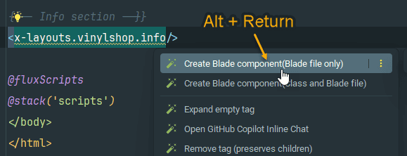
Refactor all Pages to use the New Layout
Vinyl Shop pages
Until now, we have only tree pages in our Vinyl Shop project: the home page, the contact page, and the records page. Open those files and wrap the content inside the <x-layouts.vinylshop> component. All the content will be rendered inside the default {{ slot }} of the layout.
Delete the h1 tag because the default title is already set in the layout component.
php
<x-layouts.vinylshop>
    <p>Welcome to the website of The Vinyl Shop,
        a large online store with lots of (classic) vinyl records.</p>
</x-layouts.vinylshop>
1
2
3
4
2
3
4

Authenticated User Pages ( app.blade.php)
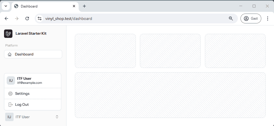
All pages for authenticated users uses the app layout. All we have to do is swap the layout component from <x-layouts.app.sidebar> to <x-layouts.vinylshop>.
Open the resources/views/components/layouts/app.blade.php replace the layout component:
php
<x-layouts.app.sidebar :title="$title ?? null">
    <flux:main>
        {{ $slot }}
    </flux:main>
</x-layouts.app.sidebar>
1
2
3
4
5
2
3
4
5
Guest Pages ( auth.blade.php)
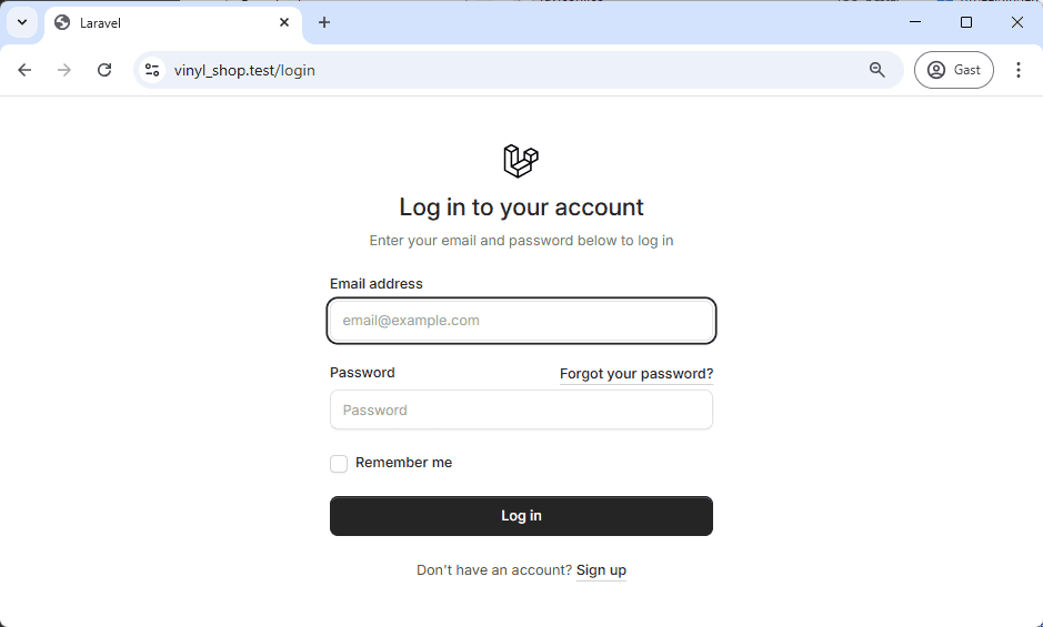
The guest pages are the login and register pages. These pages are also using the auth.simple layout. Just like the authenticated user pages, we can replace the layout component from <x-layouts.auth.simple> to <x-layouts.vinylshop>.
Open the resources/views/components/layouts/auth.blade.php file and replace the layout component:
php
<x-layouts.auth.simple>
    {{ $slot }}
</x-layouts.auth.simple>
1
2
3
2
3
Change some Global Settings
Update the default font family
Although completely optional, Flux UI recommend using the Inter font family for the application. The best place to set the font family is in the global resources/css/app.css file.
Open the resources/css/app.css file. Import the Inter font family from Google Fonts as the first line in the file (must be imported before tailwindcss). Replace --font-sans inside @theme with Inter, sans-serif.
php
@import url('https://fonts.googleapis.com/css2?family=Inter:ital,opsz,wght@0,14..32,100..900;1,14..32,100..900&display=swap');
@import 'tailwindcss';
@import '../../vendor/livewire/flux/dist/flux.css';

...

@theme {
  --font-sans: "Inter", sans-serif;
  ...
}
1
2
3
4
5
6
7
8
9
10
2
3
4
5
6
7
8
9
10
Replace the Laravel logo
The default Laravel logo displayed in the sidebar and on the login and register pages can be replaced with a custom logo.
Out of the box, Flux UI provides all the icons from the Heroicons library, but there is no vinyl record icon in the library.
If you need more icons, Flux recommends the Lucide library, which provides a wide range (1600+) of icons. This library contains a suitable logo (disc-3) that can be used as a vinyl record icon.
To use Lucide icons, Flux provides a convenient artisan command to import them into your project:php artisan flux:icon <icon-name> <icon-name> ...
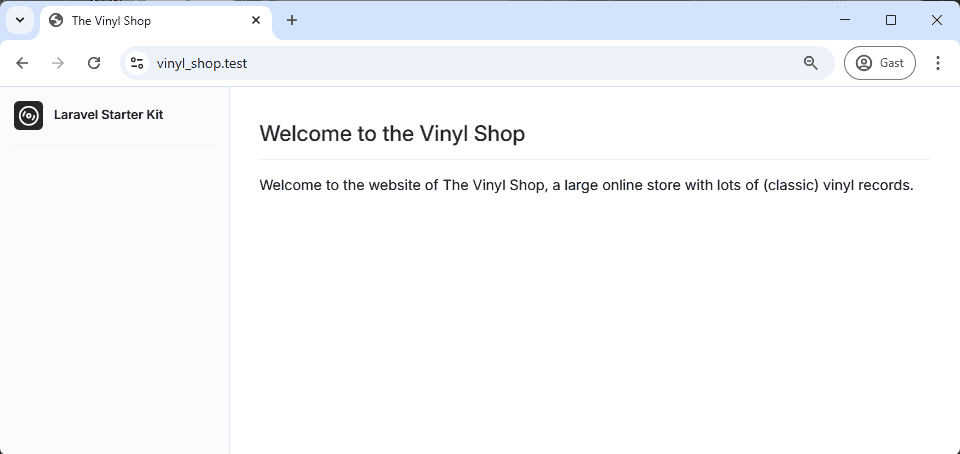
Run the command php artisan flux:icon disc-3 to import the disc-3 icon from the Lucide library. Now open the file resources/views/components/app-logo-icon.blade.php and replace the old icon with the new one:
php
<div class="flex aspect-square size-8 items-center justify-center rounded-md bg-accent-content text-accent-foreground">
    {{-- <x-app-logo-icon class="size-5 fill-current text-white dark:text-black" /> --}}
    <flux:icon.disc-3 />
</div>
<div class="ms-1 grid flex-1 text-start text-sm">
    <span class="mb-0.5 truncate leading-tight font-semibold">Laravel Starter Kit</span>
</div>
1
2
3
4
5
6
7
2
3
4
5
6
7
Update the sidebar header
The sidebar header contains the new logo, but the title is still Laravel Starter Kit. The file that contains the sidebar header is resources/views/components/app-logo.blade.php. Open this file and replace the title with The Vinyl Shop.
php
<div class="flex aspect-square size-8 items-center justify-center rounded-md bg-accent-content text-accent-foreground">
    <flux:icon.disc-3 />
</div>
<div class="ml-1 grid flex-1 text-left text-sm">
    <span class="mb-0.5 truncate leading-none font-semibold">The Vinyl Shop</span>
</div>
1
2
3
4
5
6
2
3
4
5
6

Switch the color theme (optional)
TIP
This is completely optional, but you can generate a new color theme for all the Flux UI components. Go to the Flux Themes site. Choose one of the color themes and click the Generate theme button.
Replace the default color theme with the new one.
- The first
@themeblock contains the different color shades for the dark theme. - The second
@layer theme .darkblock contains the same accent colors for the dark theme.
php
...

/* Re-assign Flux's gray of choice... */
@theme {
    --font-sans: "Inter", sans-serif;
    --color-zinc-50: var(--color-slate-50);
    --color-zinc-100: var(--color-slate-100);
    --color-zinc-200: var(--color-slate-200);
    --color-zinc-300: var(--color-slate-300);
    --color-zinc-400: var(--color-slate-400);
    --color-zinc-500: var(--color-slate-500);
    --color-zinc-600: var(--color-slate-600);
    --color-zinc-700: var(--color-slate-700);
    --color-zinc-800: var(--color-slate-800);
    --color-zinc-900: var(--color-slate-900);
    --color-zinc-950: var(--color-slate-950);

    --color-accent: var(--color-teal-600);
    --color-accent-content: var(--color-teal-600);
    --color-accent-foreground: var(--color-white);
}
@layer theme {
    .dark {
        --color-accent: var(--color-teal-600);
        --color-accent-content: var(--color-teal-400);
        --color-accent-foreground: var(--color-white);
    }
}
1
2
3
4
5
6
7
8
9
10
11
12
13
14
15
16
17
18
19
20
21
22
23
24
25
26
27
28
2
3
4
5
6
7
8
9
10
11
12
13
14
15
16
17
18
19
20
21
22
23
24
25
26
27
28
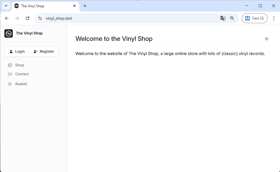
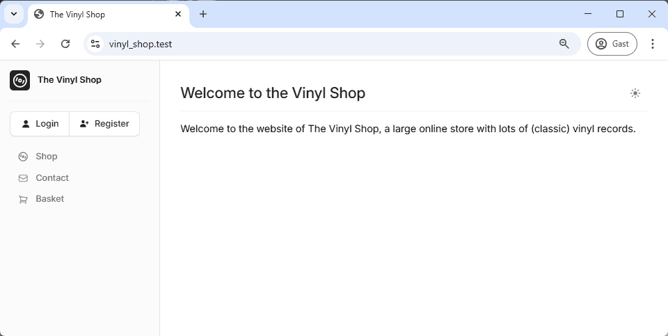
This is the result for the teal theme with slade colors. 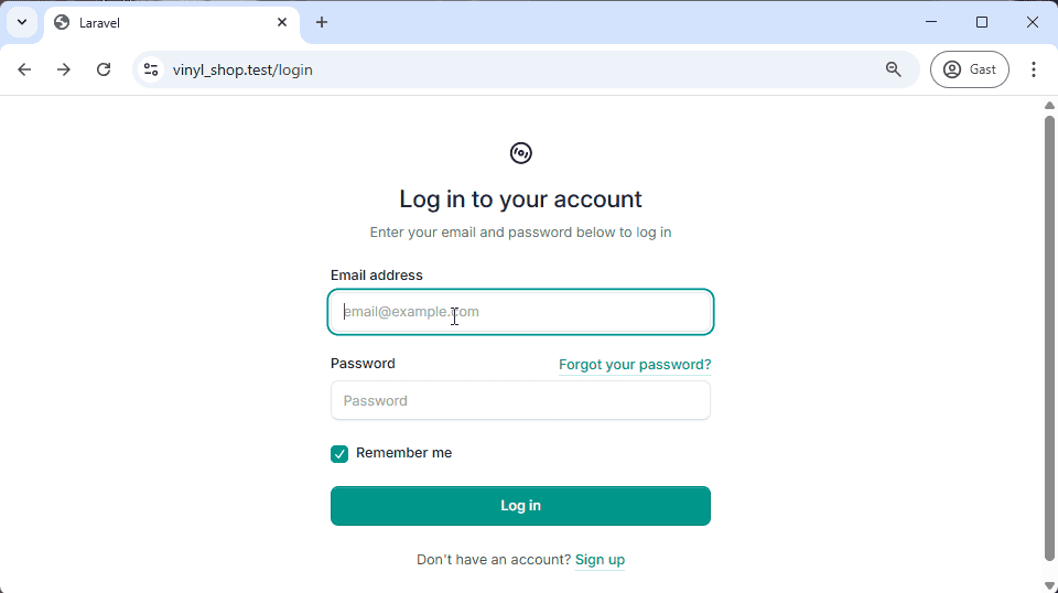
Child Components
All our child components are stored in the resources/views/components/layouts/vinylshop directory.
toggle_mode.blade.php
The mode switch component allows the user to toggle between light and dark mode. The dark mode documentation contains a few examples of how to implement this component. We will use a combination of the Toggle button and the Dropdown menu examples.
Open the resources/views/components/layouts/vinylshop/toggle_mode.blade.php file and replace the content with the following code:
php
<flux:button id="toggle-mode" x-data x-on:click="$flux.dark = ! $flux.dark" variant="subtle" square class="group">
    <flux:icon.sun x-show="$flux.appearance === 'light'" variant="mini" class="text-zinc-500 dark:text-white" />
    <flux:icon.moon x-show="$flux.appearance === 'dark'" variant="mini" class="text-zinc-500 dark:text-white" />
    <flux:icon.moon x-show="$flux.appearance === 'system' && $flux.dark" variant="mini" />
    <flux:icon.sun x-show="$flux.appearance === 'system' && ! $flux.dark" variant="mini" />
</flux:button>
1
2
3
4
5
6
2
3
4
5
6
<flux:button>: This is a button component that toggles the dark mode on and off.- The
<flux:icon.moon ...icon is displayed when the dark mode is active. - The
<flux:icon.sun ...icon is displayed when the light mode is active.

navbar.blade.php
The top navigation bar contains all the links we are gone use in the Vinyl Shop project. For now, most of the links are just dummy links (href="#"), but we will replace them with real links later on. The total navigation is split into tree parts:
- Login and Register buttons: Are only visible to guests.
- Shop, Contact, and Cart links: Are visible to all users.
- Admin links: Are only visible to authenticated users with the admin role.
NOTE
We will implement the role system later in this course. For now, all the authenticated users can see the admin links.
Before we start with the navbar, we need to know how to check if a user is authenticated and how to retrieve information about the authenticated user.
Retrieving the Authenticated User
You may access the authenticated user via the auth() helper function or via the Auth facade. Here are a few examples of how to retrieve the authenticated user and some of its attributes:
php
// Get the currently authenticated user
$user = auth()->user();                 // or Auth::user();

// Get one attribute off the currently authenticated user (e.g. name, email, id, ...)
$name = auth()->user()->name;           // or Auth::user()->name;

// Call a method on the User model
$initials = auth()->user()->initials(); // or Auth::user()->initials();

// Shortcut for the currently authenticated user's id
$id = auth()->id();                     // or Auth::id();
1
2
3
4
5
6
7
8
9
10
11
2
3
4
5
6
7
8
9
10
11
Authentication Directives and Helpers Inside Blade
The @auth and @guest Blade directives may be used to quickly determine if the current user is authenticated or is a guest. You can also use the auth() helper function or Auth facade (see above) inside a Blade template.
php
@guest
    // only visible for guests and NOT for authenticated users (= not logged in)
@endguest

@auth
    // only visible for authenticated users and NOT for guests (= logged in)
@endauth
1
2
3
4
5
6
7
2
3
4
5
6
7
Open the resources/views/components/layouts/vinylshop/navbar.blade.php file and replace the content with the following code:
blade
{{-- only visible for guests --}}
@guest
    <flux:button.group id="auth-buttons">
        <flux:button icon="user" href="{{ route('login') }}">Login</flux:button>
        <flux:button icon="user-plus" href="{{ route('register') }}">Register</flux:button>
    </flux:button.group>
@endguest

{{-- visible for all --}}
<flux:navlist variant="outline">
    <flux:navlist.item icon="disc-3" href="#">Shop</flux:navlist.item>
    <flux:navlist.item icon="envelope" href="{{ route('contact') }}">Contact</flux:navlist.item>
    <flux:navlist.item icon="shopping-cart" href="#">Basket</flux:navlist.item>
</flux:navlist>

{{-- only visible for authenticated users --}}
@auth
    <flux:navlist variant="outline">
        <flux:navlist.item icon="list-bullet" href="#">Order history</flux:navlist.item>
    </flux:navlist>
    {{-- only visible for site administartors --}}
    @if (auth()->user()->admin)
        <flux:separator variant="subtle"/>
        <flux:navlist.group expandable heading="Admin">
            <flux:navlist.item href="#">Genres</flux:navlist.item>
            <flux:navlist.item href="{{ route('admin.records') }}">Records</flux:navlist.item>
            <flux:navlist.item href="{{ route('admin.covers') }}">Covers</flux:navlist.item>
            <flux:navlist.group expandable expanded="false" heading="Users">
                <flux:navlist.item href="#">Basic</flux:navlist.item>
                <flux:navlist.item href="#">Advanced</flux:navlist.item>
                <flux:navlist.item href="#">Expert</flux:navlist.item>
            </flux:navlist.group>
            <flux:navlist.item href="#">Orders</flux:navlist.item>
        </flux:navlist.group>
    @endif
@endauth
1
2
3
4
5
6
7
8
9
10
11
12
13
14
15
16
17
18
19
20
21
22
23
24
25
26
27
28
29
30
31
32
33
34
35
36
2
3
4
5
6
7
8
9
10
11
12
13
14
15
16
17
18
19
20
21
22
23
24
25
26
27
28
29
30
31
32
33
34
35
36
profile.blade.php
We can copy the profile section straight original app layout component and wrap it in a @auth block.
Open the resources/views/components/layouts/vinylshop/profile.blade.php file and replace the content with the following code:
php
{{-- Profile block copied layouts/app/sidebar.blade.php --}}
@auth
    <flux:dropdown position="bottom" align="start">
        <flux:profile
            :name="auth()->user()->name"
            :initials="auth()->user()->initials()"
            icon-trailing="chevrons-up-down"
        />

        <flux:menu class="w-[220px]">
            <flux:menu.radio.group>
                <div class="p-0 text-sm font-normal">
                    <div class="flex items-center gap-2 px-1 py-1.5 text-left text-sm">
                                <span class="relative flex h-8 w-8 shrink-0 overflow-hidden rounded-lg">
                                    <span
                                        class="flex h-full w-full items-center justify-center rounded-lg bg-neutral-200 text-black dark:bg-neutral-700 dark:text-white"
                                    >
                                        {{ auth()->user()->initials() }}
                                    </span>
                                </span>

                        <div class="grid flex-1 text-left text-sm leading-tight">
                            <span class="truncate font-semibold">{{ auth()->user()->name }}</span>
                            <span class="truncate text-xs">{{ auth()->user()->email }}</span>
                        </div>
                    </div>
                </div>
            </flux:menu.radio.group>
            <flux:menu.separator/>
            <flux:menu.radio.group>
                <flux:menu.item href="/settings/profile" icon="cog" wire:navigate>{{ __('Settings') }}</flux:menu.item>
            </flux:menu.radio.group>
            <flux:menu.separator/>
            <form method="POST" action="{{ route('logout') }}" class="w-full">
                @csrf
                <flux:menu.item as="button" type="submit" icon="arrow-right-start-on-rectangle" class="w-full">
                    {{ __('Log Out') }}
                </flux:menu.item>
            </form>
        </flux:menu>
    </flux:dropdown>
@endauth
1
2
3
4
5
6
7
8
9
10
11
12
13
14
15
16
17
18
19
20
21
22
23
24
25
26
27
28
29
30
31
32
33
34
35
36
37
38
39
40
41
42
2
3
4
5
6
7
8
9
10
11
12
13
14
15
16
17
18
19
20
21
22
23
24
25
26
27
28
29
30
31
32
33
34
35
36
37
38
39
40
41
42
This component also uses some of the auth() helper functions to retrieve the authenticated user's name, his email address and his initials.
NOTE
In the script above, we use a few times this syntax: {{ __('xxx') }}. The value inside the __('xxx') function is a translation key that makes it possible to translate the text into different languages.
More about translation methods can be found in the config -> localization section.
info.blade.php
The info section is only used for debugging purposes and is only visible in the local environment. This section contains links to our local mailserver (mailpit) and to the documentation of the used packages (Livewire, Flux UI, Tailwind, Laravel, and Alpine). It als shows the current Laravel version you are using.
The component is wrapped in an @env('local') block to make it only visible in the local environment (= when APP_ENV=local in our .env file).
Open the resources/views/components/layouts/vinylshop/info.blade.php file and replace the content with the following code:
php
@env('local')
<div class="fixed z-50 bottom-4 right-4">
<flux:dropdown>
<flux:button icon-trailing="chevron-up-down" variant="primary" size="xs">
<span class="sm:hidden">< 640</span>
<span class="hidden sm:block md:hidden">SM | 640 - 768</span>
<span class="hidden md:block lg:hidden">MD | 768 - 1024</span>
<span class="hidden lg:block xl:hidden">LG | 1024 - 1280</span>
<span class="hidden xl:block 2xl:hidden">XL | 1280 - 1536</span>
<span class="hidden 2xl:block">2XL | > 1536</span>
</flux:button>
<flux:menu>
<flux:menu.item icon="envelope-open" href="http://localhost:8025" target="_mail">Mailpit</flux:menu.item>
<flux:menu.separator />
<flux:menu.item icon="document-check" variant="danger" href="https://livewire.laravel.com/docs" target="_tall">Livewire</flux:menu.item>
<flux:menu.item icon="document-check" variant="danger" href="https://fluxui.dev" target="_tall">Flux UI</flux:menu.item>
<flux:menu.item icon="document-check" variant="danger" href="https://tailwindcss.com/docs" target="_tall">Tailwind</flux:menu.item>
<flux:menu.item icon="document-check" variant="danger" href="https://laravel.com/docs/12.x/" target="_tall">Laravel</flux:menu.item>
<flux:menu.item icon="document-check" variant="danger" href="https://tailwindcss.com/docs" target="_tall">Alpine</flux:menu.item>
<flux:menu.separator />
<flux:menu.item icon="shield-check" href="https://heroicons.com/" target="_icons">Heroicons</flux:menu.item>
<flux:menu.item icon="shield-check" href="https://lucide.dev/icons/" target="_icons">Lucide icons</flux:menu.item>
<flux:menu.separator />
<flux:subheading class="p-2">Laravel {{ app()->version() }}</flux:subheading>
</flux:menu>
</flux:dropdown>
</div>
@endenv1
2
3
4
5
6
7
8
9
10
11
12
13
14
15
16
17
18
19
20
21
22
23
24
25
26
27
28
2
3
4
5
6
7
8
9
10
11
12
13
14
15
16
17
18
19
20
21
22
23
24
25
26
27
28
favicons.blade.php (exercise)
The last child component will hold the code for the favicons. Search for a suitable favicon image and create the favicons with the Real Favicon Generator. The icons should be placed in the public/assets/icons directory.
TIP: use absolute paths for the icons, otherwise the icons will not be displayed on all pages.
The result for the login page should look like this: ![]()