Appearance
Livewire Starter Kit
With a foundational understanding of routing and Blade views established, we can now delve into the Livewire starter kit. Initially, we'll examine the full registration and login process, followed by an exploration of the layout structure and its constituent components. Acquiring a thorough grasp of the starter kit's layout and components will empower us to construct our own tailored layout page and elements in the next chapters.
Registration and Login Routes
Upon executing the php artisan route:list --except-vendor command, a multitude of routes associated with the registration and login functionalities become apparent. These routes collectively orchestrate the user authentication flow. 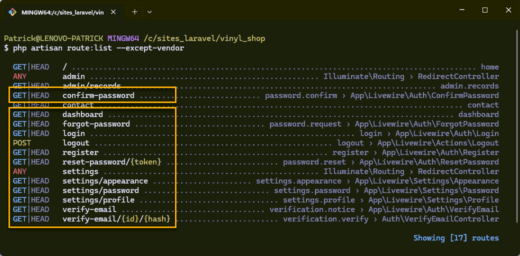
Register
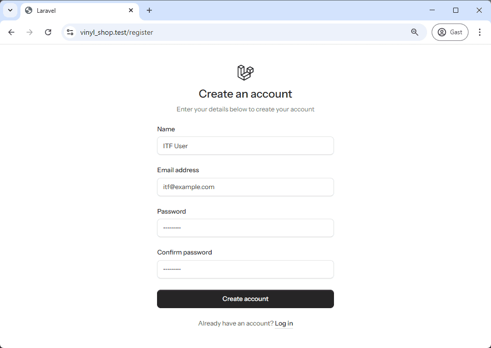
To initiate the process, navigate to https://vinyl_shop.test/register and complete the registration form to create a new user account.
Following successful registration, you will be redirected to a rudimentary dashboard interface, featuring a prominent link to the home page, accessible via the Laravel Starter Kit link positioned at the top of the page.
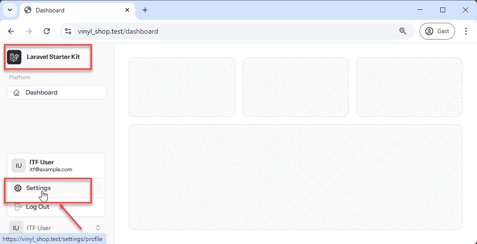
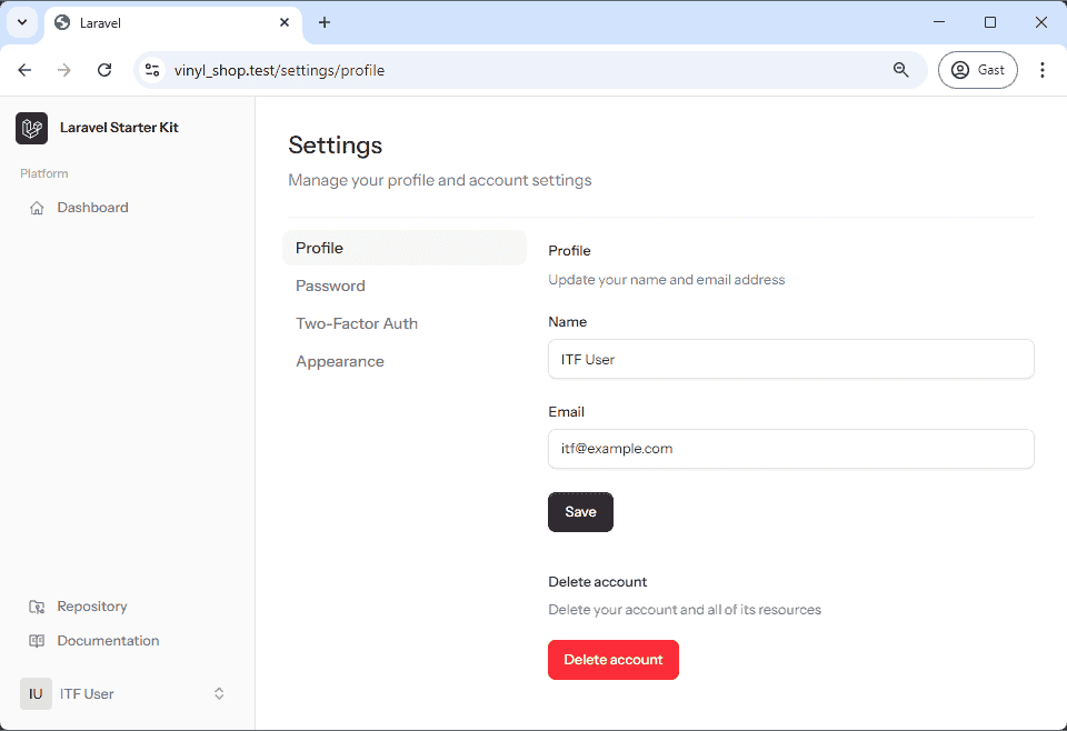
Update Profile
Within the popup menu located at the bottom of the dashboard, a link to the settings page is provided. Clicking this link will lead you to a page where you can modify your profile settings, including your name, email address, password and switch between light and dark modes.
Forgot Password
To simulate a forgotten password scenario, log out of your account and access the login page: https://vinyl_shop.test/login. Just above the password field, you'll find a Forgot your password? link. Clicking this link will redirect you to a password reset request form.
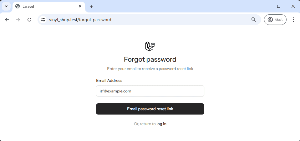
Enter the email address associated with your account and click the Send password reset link button. Subsequently, check your email inbox at https://localhost:8025 for a password reset link.
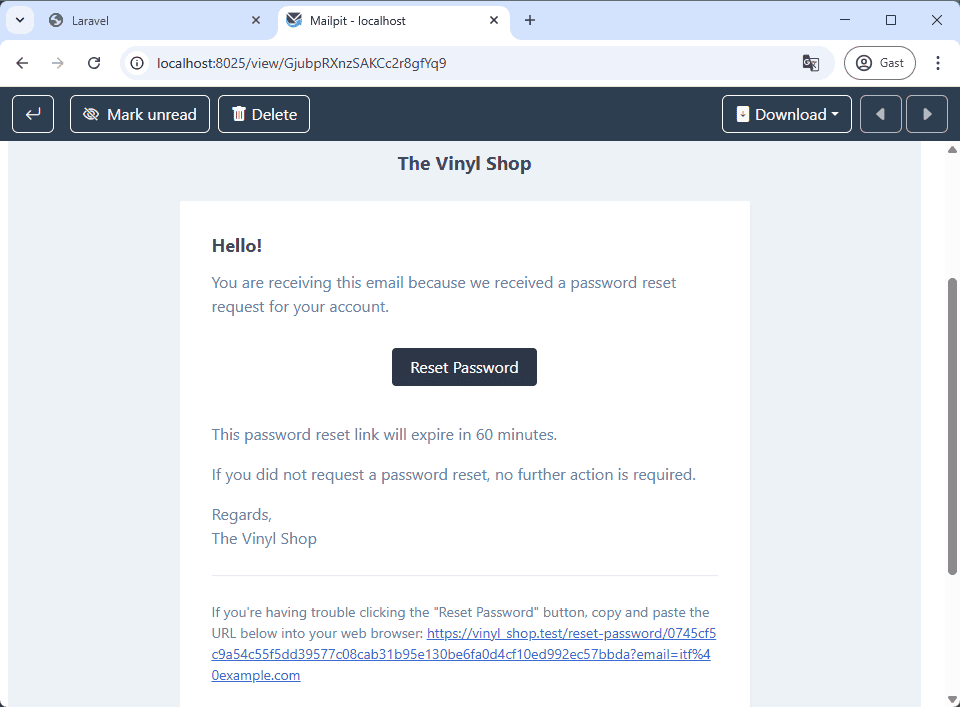
Click the link provided in the email to access the password reset form.
The reset password link brings you to this page:
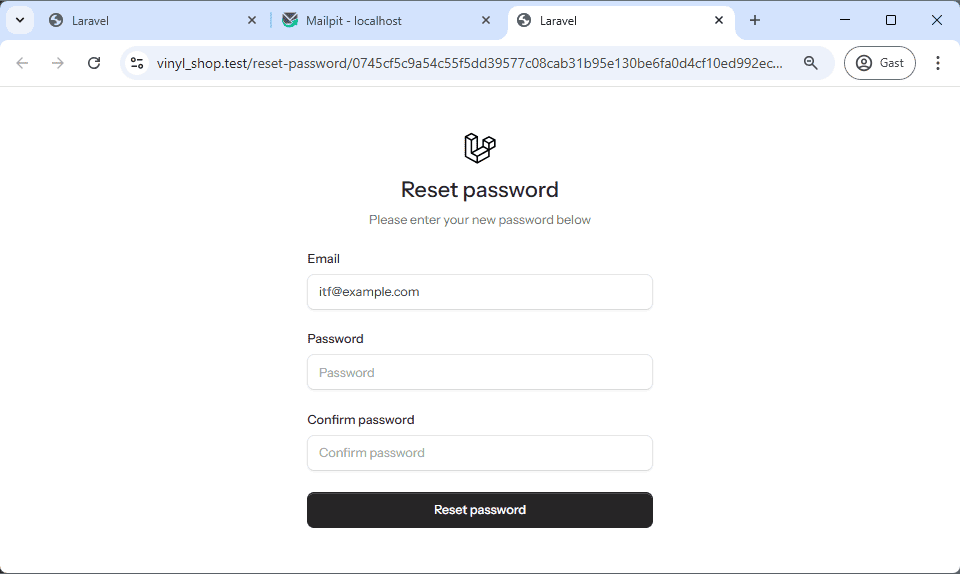
Enter your new password, confirm it, and submit the form. Upon successful password reset, you can log in using your newly established credentials.
With the registration and login functionality in place, the next step is to understand the layout components that structure the application's user interface.
Layout Components
The Livewire starter kit uses Blade components to manage its layouts. These components are reusable building blocks that help you organize and structure your application's user interface. All Blade components in the starter kit live inside the resources/views/components directory.
Understanding Blade Components (x-)
Think of the x- prefix as a shortcut to a component file. When you see a tag like <x-layouts.auth>, it's telling Laravel to look for a file in your resources/views/components directory. The dots in the name (layouts.auth) represent subdirectories, so this tag is a shortcut for the file at resources/views/components/layouts/auth.blade.php. This structure lets you keep your components organized and easy to reuse throughout your application.
Injecting Content with $slot
Blade components can also receive and render content you pass to them. This is done using the special $slot variable. Think of $slot as a placeholder within your component's file. Any content you place between the opening and closing tags of a component will be "injected" into the component's layout wherever the {{ $slot }} directive is. For example, if you have a component my-component.blade.php that contains <h1>{{ $slot }}</h1>, and you use <x-my-component>Hello World</x-my-component>, the final output will be <h1>Hello World</h1>.
Now that we have a foundational understanding of how Blade components work, let's look at the two main layouts provided by the Livewire starter kit.
Primary Layouts
The starter kit uses two main layouts, each designed for a specific purpose:
- The
authlayout is used for authentication-related pages like the login, registration, and password reset pages. It's designed for public-facing, unauthenticated users. - The
applayout is for pages that require a user to be logged in, such as the dashboard and settings pages. It's designed for the main application interface.
Both of these layouts are themselves Blade components. Let's look at how they are structured.
Auth Layout
The main auth layout is located in resources/views/components/layouts/auth.blade.php. This file is very simple—it acts as a container that wraps a more specific layout component, like simple, card, or split.
The default auth layout file looks like this:
php
<x-layouts.auth.simple :title="$title ?? null">
    {{ $slot }}
</x-layouts.auth.simple>This code does two things:
- It calls another component,
<x-layouts.auth.simple>. - It passes any content from the current page into the
simplelayout using the{{ $slot }}directive.
You can easily switch the visual style of your authentication pages by changing the component here. For example, to use the "card" layout, you would change the code to <x-layouts.auth.card>.
Here are the different auth layout options:
| Layout Variant | Description |
|---|---|
| Simple (default) | A clean, minimalist layout. |
| Card | Displays the form within a central card. |
| Split | Divides the page into two sections, with content on one side. |
php
<x-layouts.auth.simple :title="$title ?? null">
    {{ $slot }}
</x-layouts.auth.simple>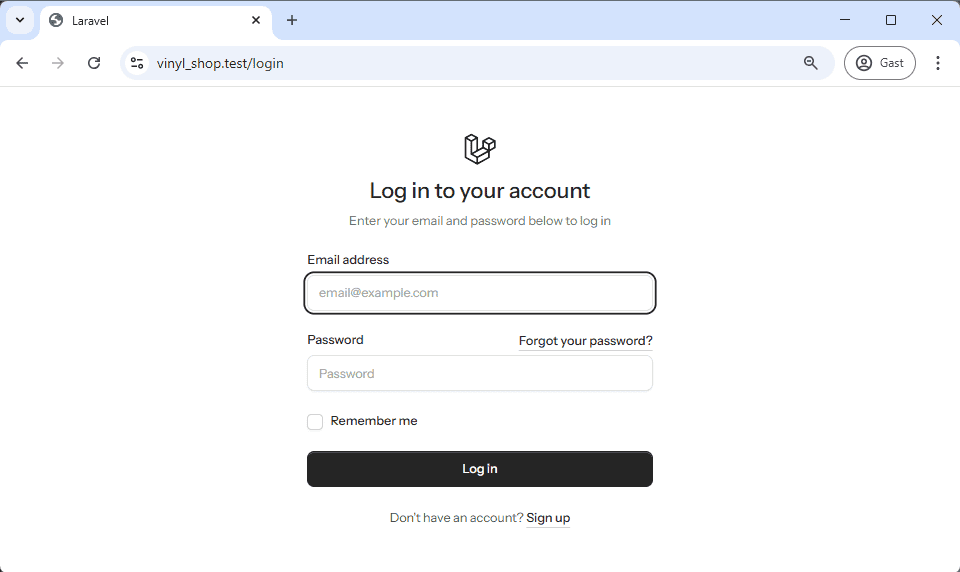
App Layout
The main app layout is in resources/views/components/layouts/app.blade.php. This layout is used for pages that require the user to be authenticated. It also has different variants, including a sidebar layout and a header layout.
The default app layout file uses a sidebar:
php
<x-layouts.app.sidebar :title="$title ?? null">
    <flux:main>
        {{ $slot }}
    </flux:main>
</x-layouts.app.sidebar>Like the auth layout, this component is a wrapper that calls another, more specific component ( <x-layouts.app.sidebar>). It also uses the $slot variable to inject the page content.
Here are the different app layout options:
| Layout Variant | Description |
|---|---|
| Sidebar (default) | Features a collapsible sidebar on the left. |
| Header | Displays all navigation items at the top of the page. |
The sidebar layout incorporates a collapsible sidebar, positioned on the left side of the page, which adapts its visibility based on screen size, remaining closed on smaller screens and expanded on larger screens.
php
<x-layouts.app.sidebar :title="$title ?? null">
    <flux:main>
        {{ $slot }}
    </flux:main>
</x-layouts.app.sidebar>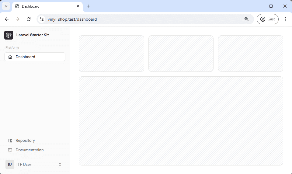
Flux UI Components
With an understanding of Blade layout components, we can now explore the Flux UI components. These components are a key part of the Livewire starter kit, providing pre-designed, reusable elements that simplify the creation of interactive and responsive user interfaces. They are specifically tailored for Livewire applications, offering pre-styled elements for a modern look that stays consistent across your application. The library includes components for sidebars, navigation lists, dropdown menus, and headers. For more information, you can refer to the official Flux UI website.
The resources/views/components/layouts/app/sidebar.blade.php file uses several of these components to create its interface. The entire user interface within the body of the app layout is built from these components. We'll focus on the main components used within the sidebar layout, as our next steps will involve creating a custom layout based on it.
Flux UI components are specified using the <flux:component> tag, which is a custom HTML tag that renders a Flux UI component. Each Flux component can have its own set of attributes and can also contain child tags, such as flux:button, flux:menu, flux:menu.item, and flux:icon.
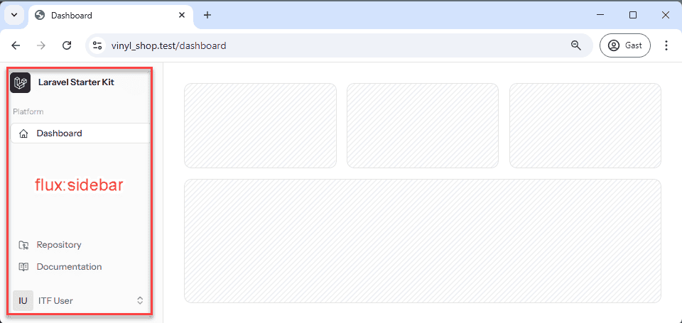
Flux:sidebar
The flux:sidebar component renders a vertical navigation container, typically positioned on the side of the application. It acts as a cohesive structure that integrates various child components, such as toggles, navlists, and menus. Key attributes you'll see include sticky, which keeps the sidebar in view as the page scrolls, and collapsible="mobile", which manages the open or collapsed state. Class attributes allow for customization of borders, backgrounds, and themes for both light and dark modes.
- sticky: Keeps the sidebar in view as the page scrolls.
- collapsible="mobile": Manages the open/collapsed state of the sidebar seamlessly.
- Class attributes: Allow customization of borders, backgrounds, and themes suitable for both light and dark modes.
Flux:sidebar.toggle
The flux:sidebar.toggle component is a button that provides an interactive way to show or hide the sidebar. It's essential for responsive designs, ensuring the sidebar can be collapsed on smaller screens. The component can accept properties like icon to specify the toggle icon (e.g., x-mark or bars-2) and responsive classes like lg:hidden to control visibility on different screen sizes.
- icon: To specify the toggle icon.
- Responsive classes: Such as
lg:hiddento control visibility on different screen sizes. - Optional inset attributes: For positioning adjustments (common in mobile headers).
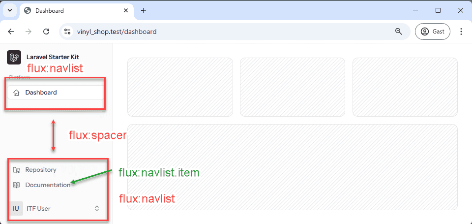
Flux:navlist
The flux:navlist component is used to organize navigation items into a structured list. It serves as a container for both grouped items and individual navigation links, and it can be styled with variants like "outline".
Flux:navlist.group
Within a flux:navlist, the flux:navlist.group component helps to bundle related navigation items under a common heading. It accepts attributes such as heading for setting the group's title, which enhances usability by logically categorizing navigation options.
- heading: A bound property for setting the group's title.
- Class attributes: For grid or layout customizations.
Flux:navlist.item
The flux:navlist.item represents an individual navigation link within a navlist group. Its key properties include icon to display an icon next to the text, href to specify the destination URL, and current to indicate if the item is active. This component also supports Livewire integration via directives like wire:navigate for smooth, reactive transitions.
- icon: Displays an icon next to the navigation text.
- href: Specifies the destination URL.
- current: A boolean value to indicate if the item is active, often used for highlighting the current page.
- Livewire integration: Via directives like
wire:navigateto enable smooth, reactive transitions.
Flux:spacer
The flux:spacer component is a simple utility used to insert vertical spacing between groups of elements. This separation enhances visual clarity and organization.
Flux:dropdown
The flux:dropdown component creates a container for interactive menu elements that appear in a dropdown. It supports properties such as position (e.g., "bottom", "top") and align ("start", "center", "end") to control its placement.
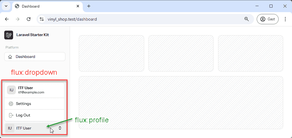
Flux:profile
The flux:profile component is designed to display a concise user profile summary and is often used within dropdown menus or headers. It can render a user's name and initials, and it can also include an optional icon-trailing to indicate additional options.
- name: The user's full name.
- initials: A shorthand representation, frequently used as an avatar substitute.
- icon-trailing: An optional trailing icon (such as "chevrons-up-down" or "chevron-down") that indicates additional interactive options.
Flux:menu
The flux:menu component defines the overall container for dropdown menu items, providing structure to the content within a dropdown. It works seamlessly with nested components.
Custom classes and styling options allow it to integrate with the overall design aesthetic of your application.
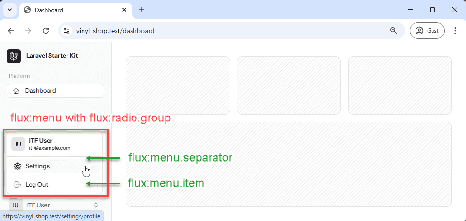
Flux:menu.radio.group
Within a menu, the flux:menu.radio.group component is used to logically group menu items that behave like radio buttons. Users can select only one option within the group, which simplifies interaction management.
Flux:menu.item
The flux:menu.item component defines an individual actionable entry within a dropdown menu. It offers flexible configuration through properties like href for navigation, icon for a visual representation, and as to conditionally render the element as a different HTML tag (e.g., a button). It also supports Livewire directives like wire:navigate to handle dynamic transitions.
- href: To navigate to a specified URL.
- icon: For displaying an associated icon to visually represent the action.
- as: To conditionally render the element as a different HTML tag (e.g., a button).
- type: Which is particularly useful when the item functions within a form context.
Flux:menu.separator
The flux:menu.separator component is a visual divider used to separate groups of menu items. It is typically rendered as a horizontal line to help clarify sections and create a more organized layout.
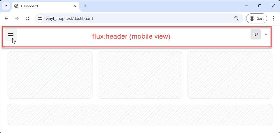
Flux:header
The flux:header component is tailored for responsive designs, particularly for mobile views. It serves as a fixed top navigation area that can include elements like toggles and profile dropdowns. This component ensures that critical navigation controls remain visible and accessible on smaller screens.